My generative research on the Starbucks register is finally done, and it’s been a lot of fun watching the novice failing on the tasks.
Here’re the four tasks the users are asked to complete:
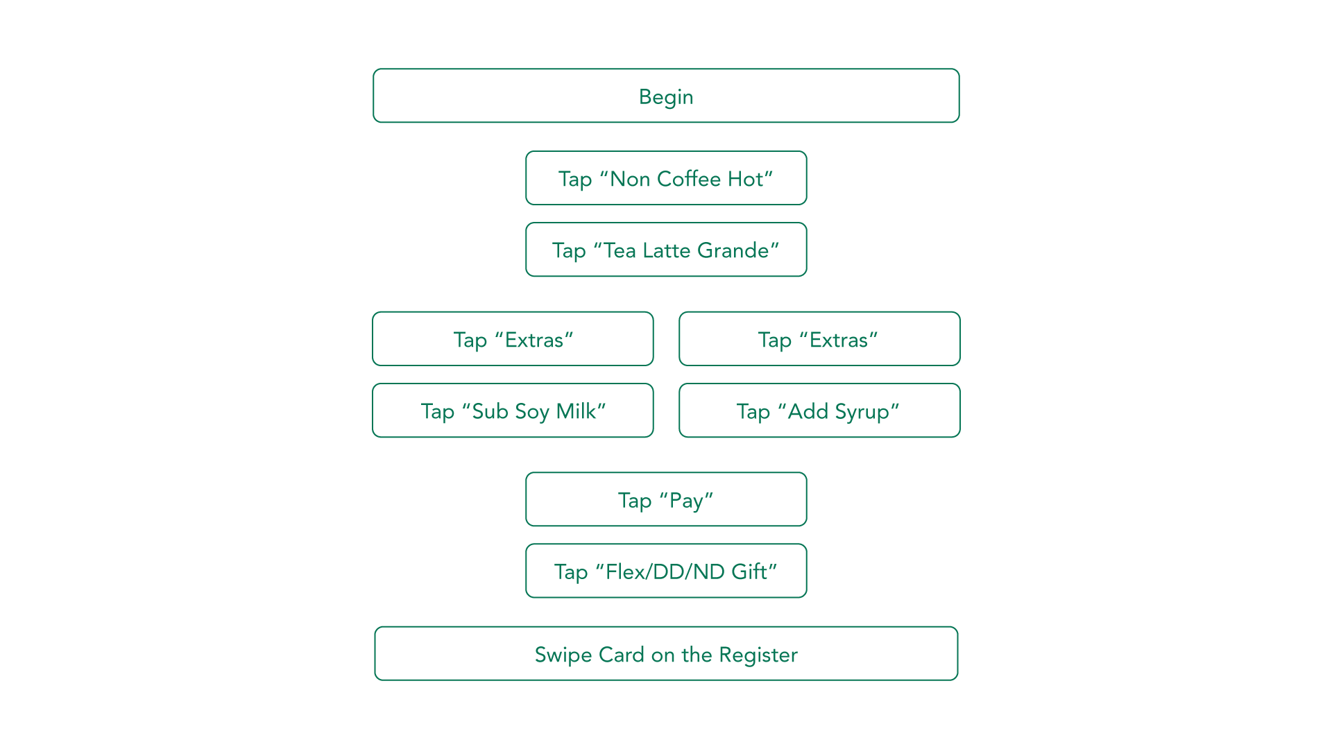 Task 1: Check out an Awake Tea Latte and pay with Student ID
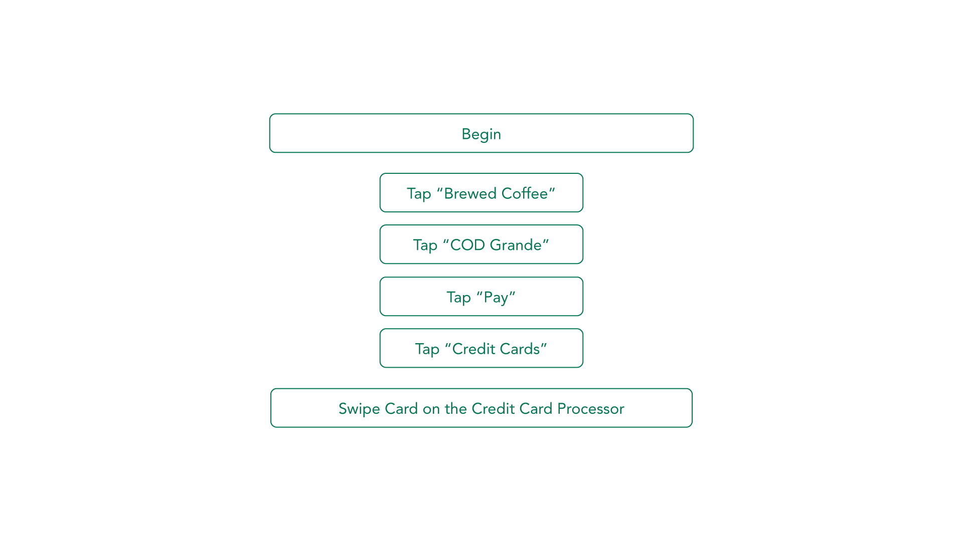 Task 2: Check out a Blonde Roast Coffee and pay with credit card
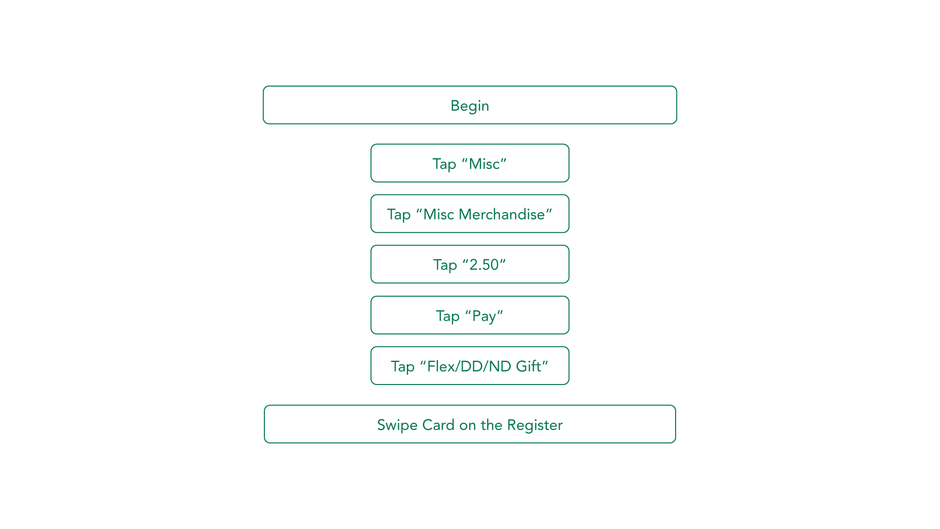 Task 3: Check out a Starbucks After Coffee Mint
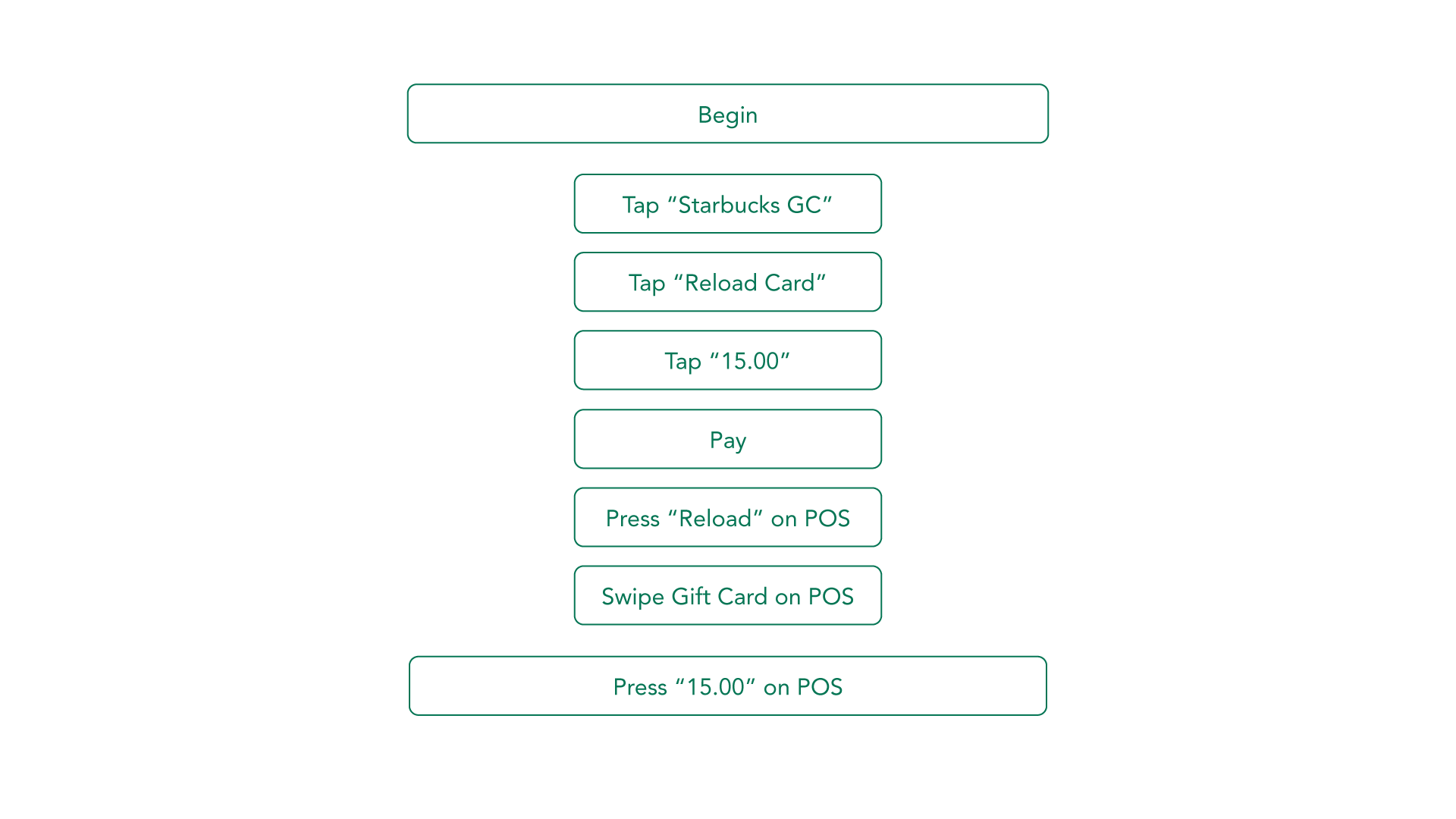 Task 3: Reload $15 on a Gift Card
Here are some things our users have complained during and in between the tasks: - The big yellow “manager” button doesn’t do anything; - The “scannable” button does nothing; - Colors are very unattractive;
I also gathered some feedback from both the expert and the novice after the tasks:
- Expert
- The interface is not easy to use; it was very hard to avoid making mistakes at the beginning, and even after she has worked there for a year, she mess things up occasionally.
- The buttons are disorganized, and there’re random TBD buttons in the system.
- Some items are not in the system (Mint, for example), so she has to manually type in the amount.
- The Trenta-sized drinks are in the “brewed coffee” category, which is very counterintuitive.
- Gift card checkout procedure is annoying: if the customer is using the mobile app, she has to manually punch in the card number to the gift card POS.
- Novice
- It’s very hard to find where the items are on the register, and checking out any complex item is hard.
- Many buttons don’t do anything at some times.
- The flow is very poor, and feedback is confusing. There’s no prompt on what to do after you perform an action.
And here’s the final video documentation!