Not a lot of Notre Dame students have the honor to live in a dorm with air conditioning, but when there is an air conditioning in the dorm, chances are you’ll need some time to figure out how to actually use it.
Look at these magical control panels—
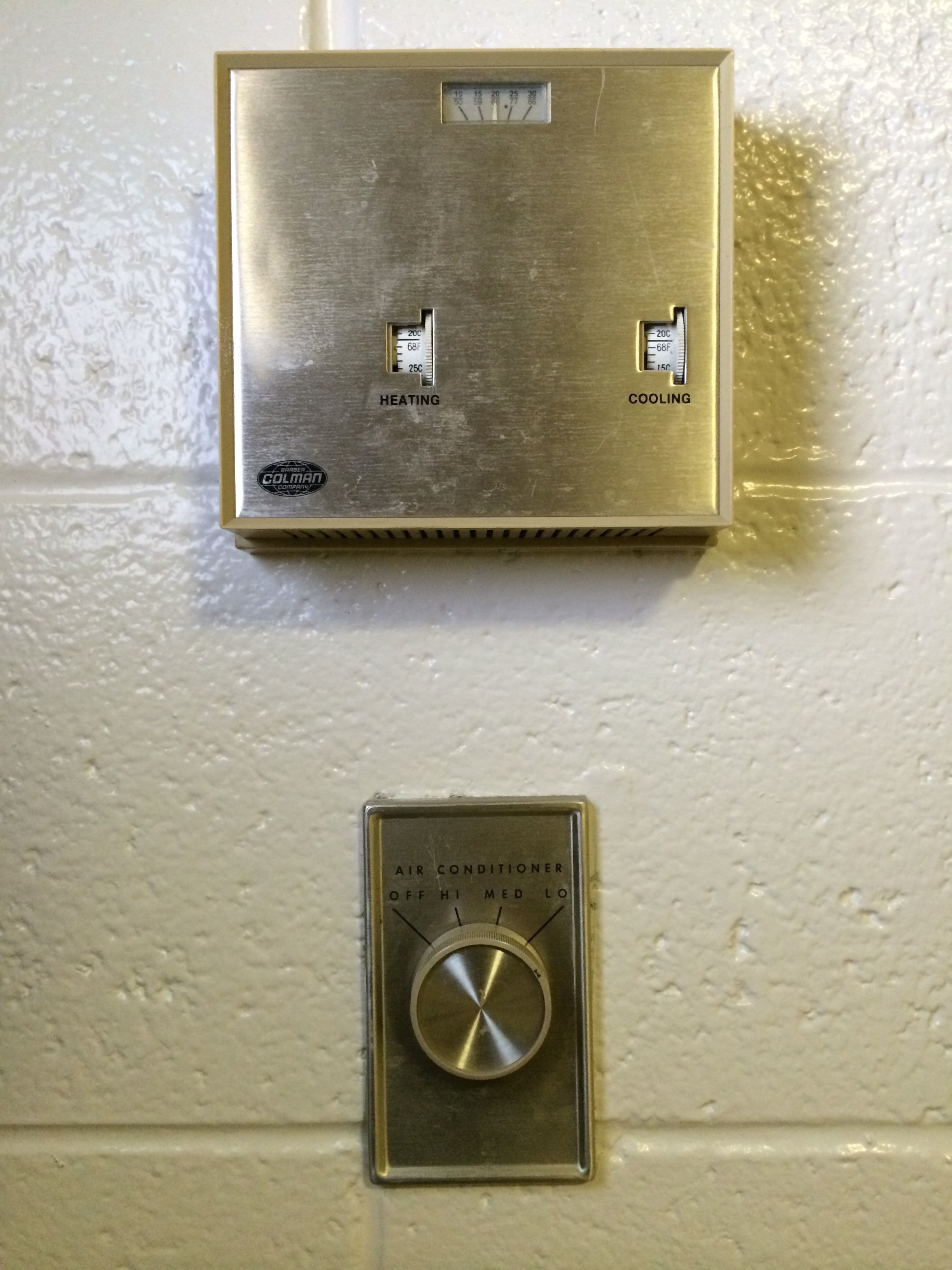 A/C Thermostat Controls
There you have it. Yes, it is very simplistic (which is usually good), and looks somewhat Art Deco, but the designers somehow managed to create confusion even with such a simple interface.
Current Issues
- There’s no direct feedback mechanism:
- The wheels are all mechanical, so when we roll it, we have no idea if the controls actually work; (just give us a light!)
- From my initial research, many people try to turn the temperature 3–5 degrees higher or lower than what they want, just to make sure the A/C is on.
- The labeling is confusing:
- What does it mean when I set “cooling” to 72F? Does it mean that I want the A/C to work when it’s warmer than 72F?
- Does “cooling” actually work, since there’s a wall unit A/C in my dorm?
- What would happen if I set “heating” to 75F?
- Will the A/C and the radiator both work at the same time?
- And… what is the knob below? Do they control the same thing?
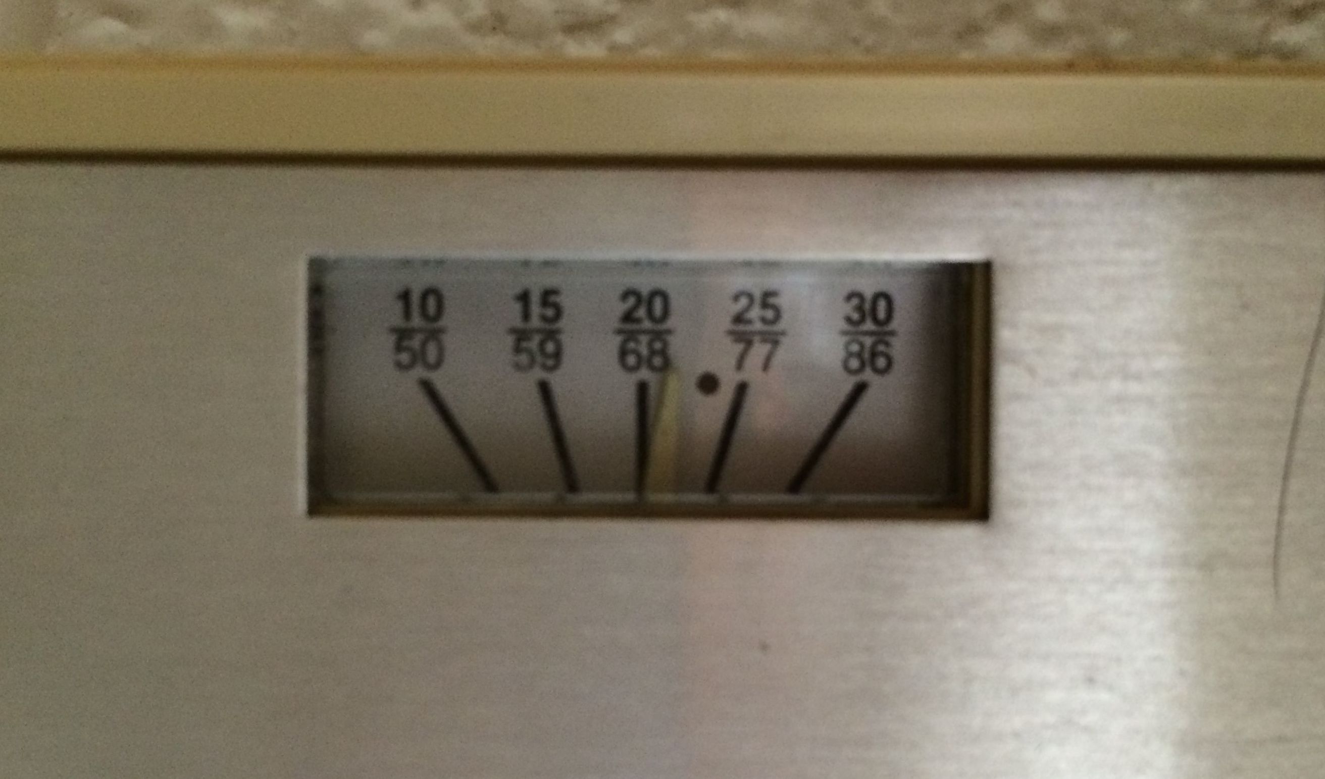 A/C Thermostat Close-up
- How should I read the thermostat?
- Why is there a tick, and also a black dot?
- What do they mean anyways?
-
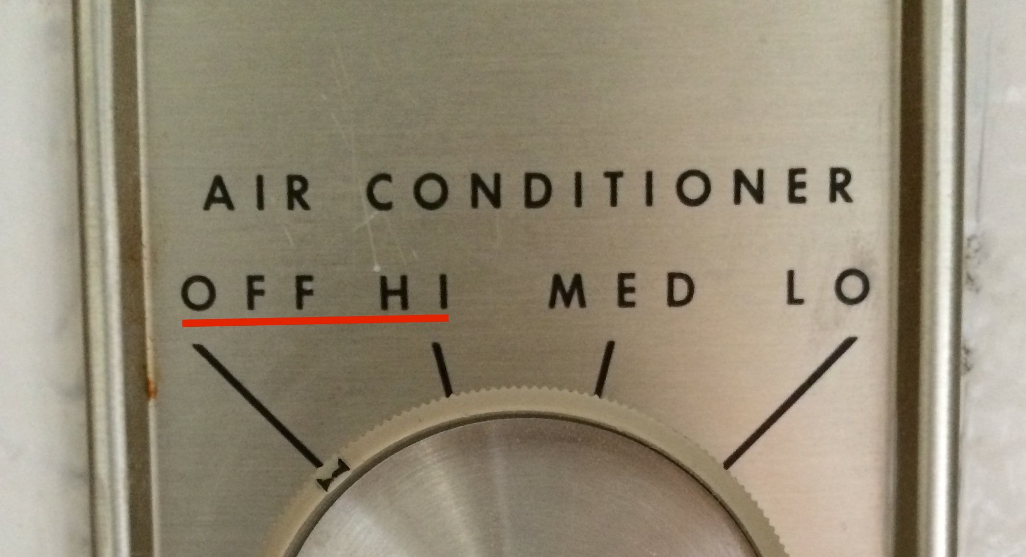
To turn the A/C on “low”, I have to first roll it to “high”. That’s an implementation detail that users don’t need to know.
- Aesthetically, it’s just ugly: bulky, dated, so much wasted space, and God! Why did they arrange the controls like that?
 They’re not even aligned!
Redesign Opportunities
-
Better feedback: feedback when the A/C is on; A/C displaying the set temperature explicitly;
- Intuitive controls: for an air conditioner/radiator, the user should be able to set the target temperature, and the system should just magically work, and make sure the temperature is adjusted correctly;
- With this, we can fix the label of the temperature controls to be just “temperature”…
- And also fix the temperature display at the same time.
- Make it look better: at least align the text!
- And redo the layout.
Apparently this system can be drastically improved, but the things we need to change are fairly simple, so I may not pursue this project. It’s great exercise for me to identify the issues, though.