When I was a freshman, I used to like the Starbucks® on campus (I still do, and I pretty much live in Starbucks) and wanted to work there to earn some extra cash. However, I realized that the Baristas® very often press wrong buttons, and when chatting with them, they always complain about the checkout system. So one day I finally decided to walk around the counter, and…
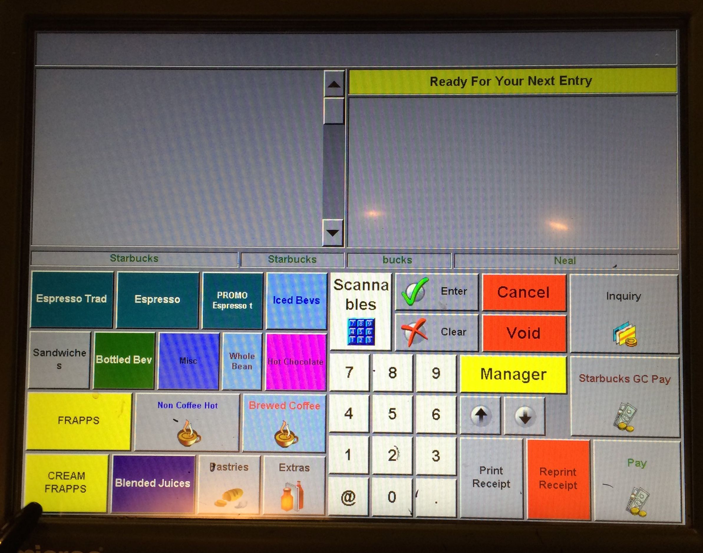 Starbucks Counter Initial Screen
Ugh.
Really?
Current Issues
- It looks really messy…
- Welcome to 1995!
- Hello, I want a Scanna-ble!
- The buttons on the left look completely randomly thrown together;
- Why do some buttons have icons, and others don’t?
- People seldom use the number pad, so why is it there?
-
The color is all wrong! Do they mean anything, or are the colors randomly jammed together as well?
- The labeling is very confusing:
- Espresso Trad?
- Espresso?
- PROMO Espresso?
Let’s dig a little deeper, and we can find more issues:
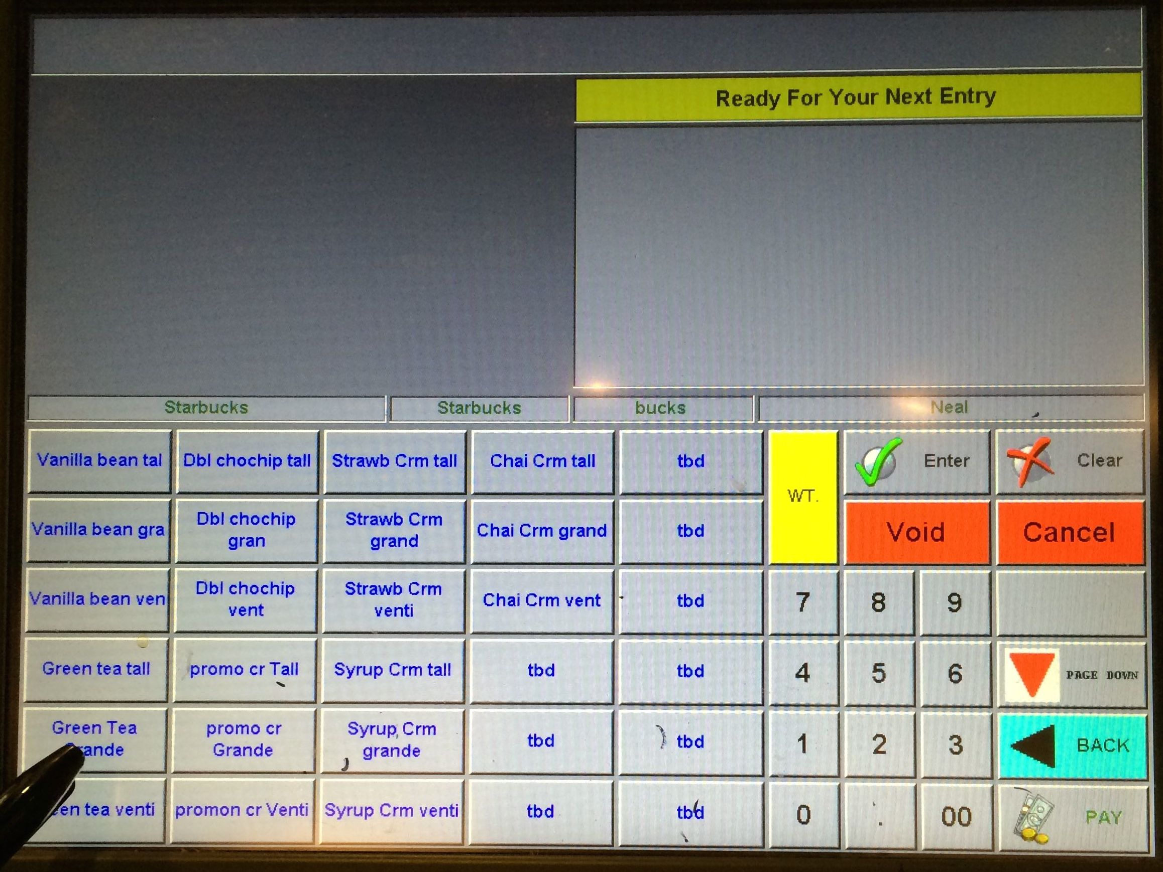 Item Chooser Screen
-
May I have a tbd, please?
-
What’s the “Starbucks Starbucks bucks Neal” all about?
-
Why can’t we select the size directly, but have to choose “drink + size”?
And let’s see a new Barista® getting confused. See how he hesitate when looking for the right button to press:
Redesign Opportunities
- Aesthetically it could be way better. It’s the 21th century now!
- The buttons look terribly dated;
- Layout is downright horrible;
- Coloring don’t make sense either.
-
The logic behind grouping of products is very weird.
- User interaction logic can be drastically improved/redesigned.
This would be a very interesting project to work on, as it’s very applicable to me (hey, I live in Starbucks), and it could be both visually and logically refreshing.