The BeatBox™ actually works
After days and weeks of implementation, the BeatBox is finished, and it works very well!
BeatBox flashing to Daft Punk
A look inside BeatBox
After days and weeks of implementation, the BeatBox is finished, and it works very well!
BeatBox flashing to Daft Punk
A look inside BeatBox
After thinking about the technical challenges and the possible ways to make the widget, I’ve settled on the third idea for the interactive widget. However, to make it more interesting, instead of making a really simple light, I would make the light respond to sound/music playing nearby, and make it flash to the beats. You can still turn off the light by turning the entire enclosure upside-down.
It’s really fun to think through this entire project, including designing the form factor, writing the code, building the circuit, and assembling the enclosure. Here are some videos I captured during the process!
Testing the circuit for orientation-sensitivity
Testing the circuit for changing the color
Laser-cutting the shell
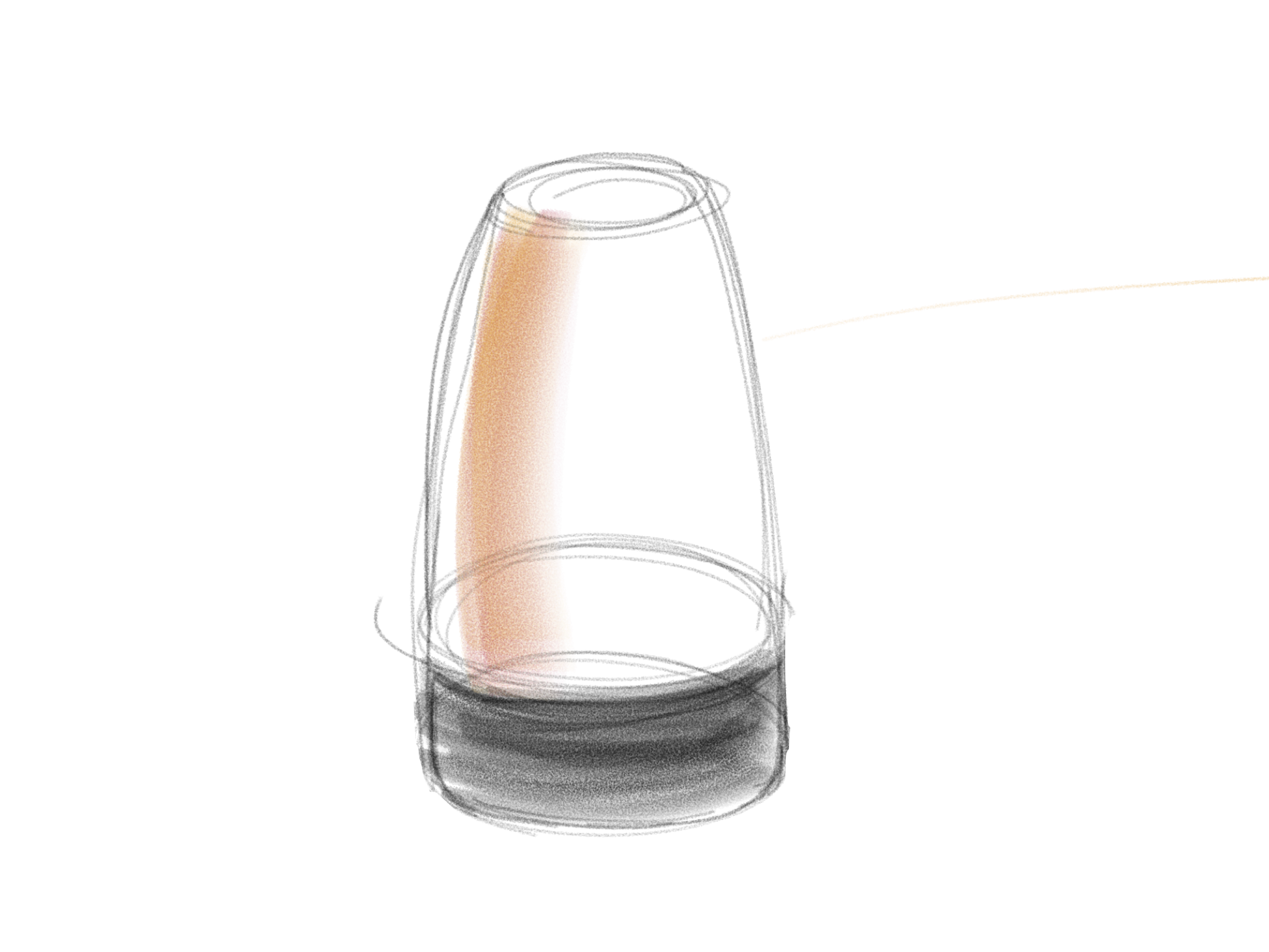
I’m almost settled down on the idea of building something that involves a light, but the form factor keeps tripping me up. My original idea is a glass-shaped light, but making it might be very hard. Here are some ideas and alternative solutions I’ve thought of:
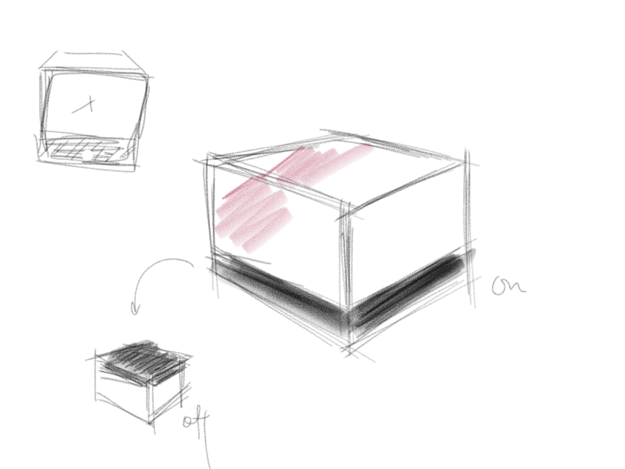 Concept 1: a box light with orientation sensitivity.
 Concept 2: inspired by the Mac Pro.
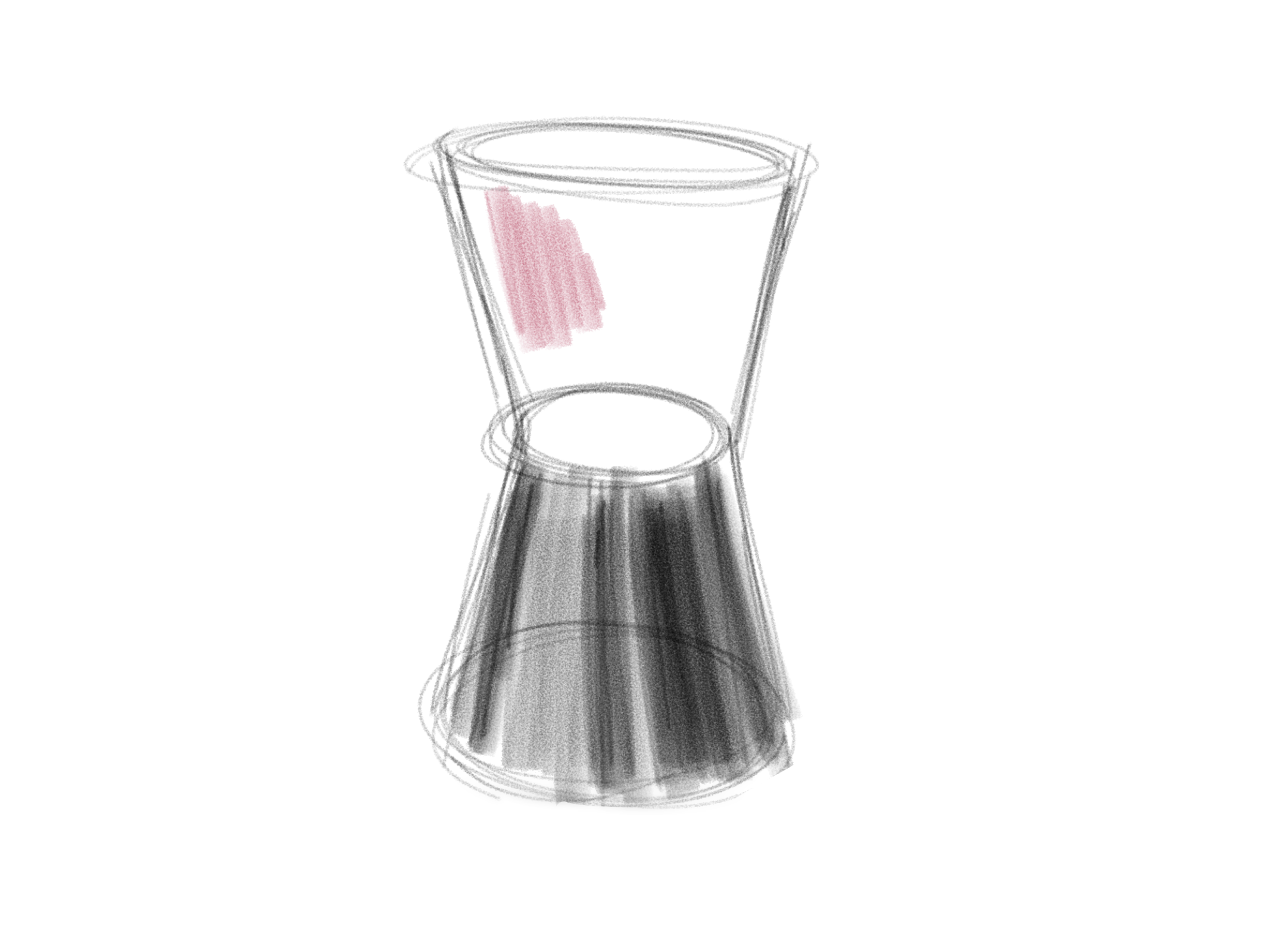 Concept 3: an hourglass that stresses the idea of orientation sensitivity.
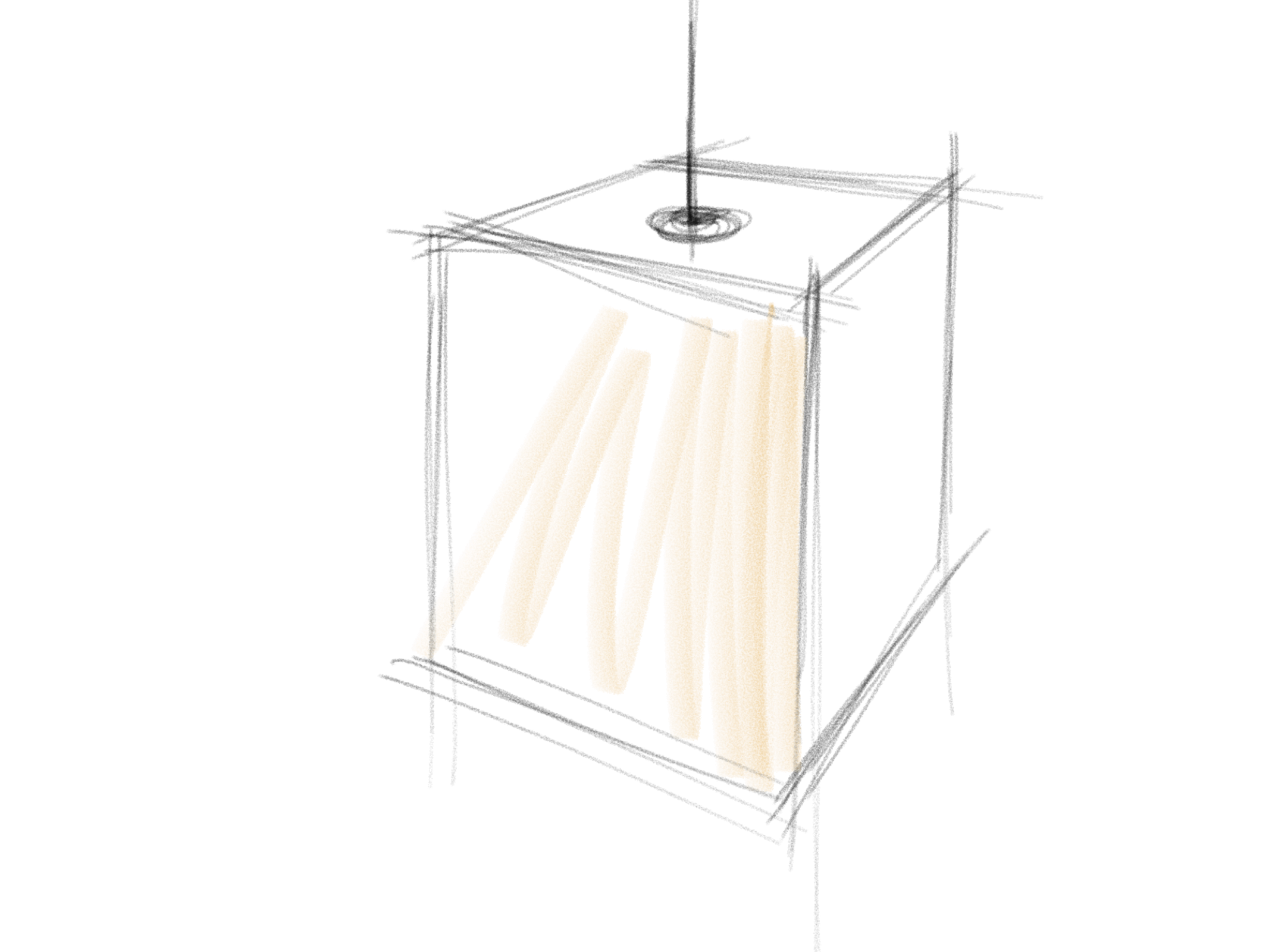 Concept 4: a lantern; this would emphasize the texture, but puts interaction at the second place.
The Interactive Widget project is very open-ended: basically we pick one idea that involves some type of human interaction, and encapsulate it into some type of form factor.
I’ve been considering several ideas. The one I’m most interested in is to create some type of “digital pet”, that feels like a living thing but has an extremely minimal form factor. My original idea is kind of like Sphero, which is just a little sphere that could sit on a desk, and it lights up and rolls towards you when your hand is nearby. The idea is to explore “intimacy” with objects that doesn’t naturally connect with the word “intimate” at all.
Another one is about time. It’s inspired by Qlocktwo, which is an alarm clock that displays time with words. My idea, similar to this, also involves displaying time with words, but instead of describing the exact time, it would intentionally only show a time interval we’re in. (Say, instead of saying “7 after 4pm”, the device would say “just past 4 o’clock”). Since we always stress over knowing the exact time, but knowing the time accurately doesn’t make a difference to us, making it imprecise may be more interesting.
The third idea is simpler—think about a cup, when it’s upside-down, we intuitively know that it’s empty, which corresponds to the “off” state in any digital device. Making a light behave similarly would be fun—turning the light upside down would turn it off, and turning it upright would make it light up again.
So… what should I make?
My evaluative research on the redesign of my Starbucks register is done. Seems like there are still some minor confusions, but there’s definitely an overall usability improvement.
Minor confusions observed and recorded:
Otherwise, the new system works very well, and users approved it!
Here are two documentaries of Maribeth (Senior coffee drinker) and Kyle (Junior coffee non-drinker) trying out the register interface.
Maribeth trying out the system
Kyle trying out the system