Sep 2, 2014
Horrible Interface 2
When I was a freshman, I used to like the Starbucks® on campus (I still do, and I pretty much live in Starbucks) and wanted to work there to earn some extra cash. However, I realized that the Baristas® very often press wrong buttons, and when chatting with them, they always complain about the checkout system. So one day I finally decided to walk around the counter, and…
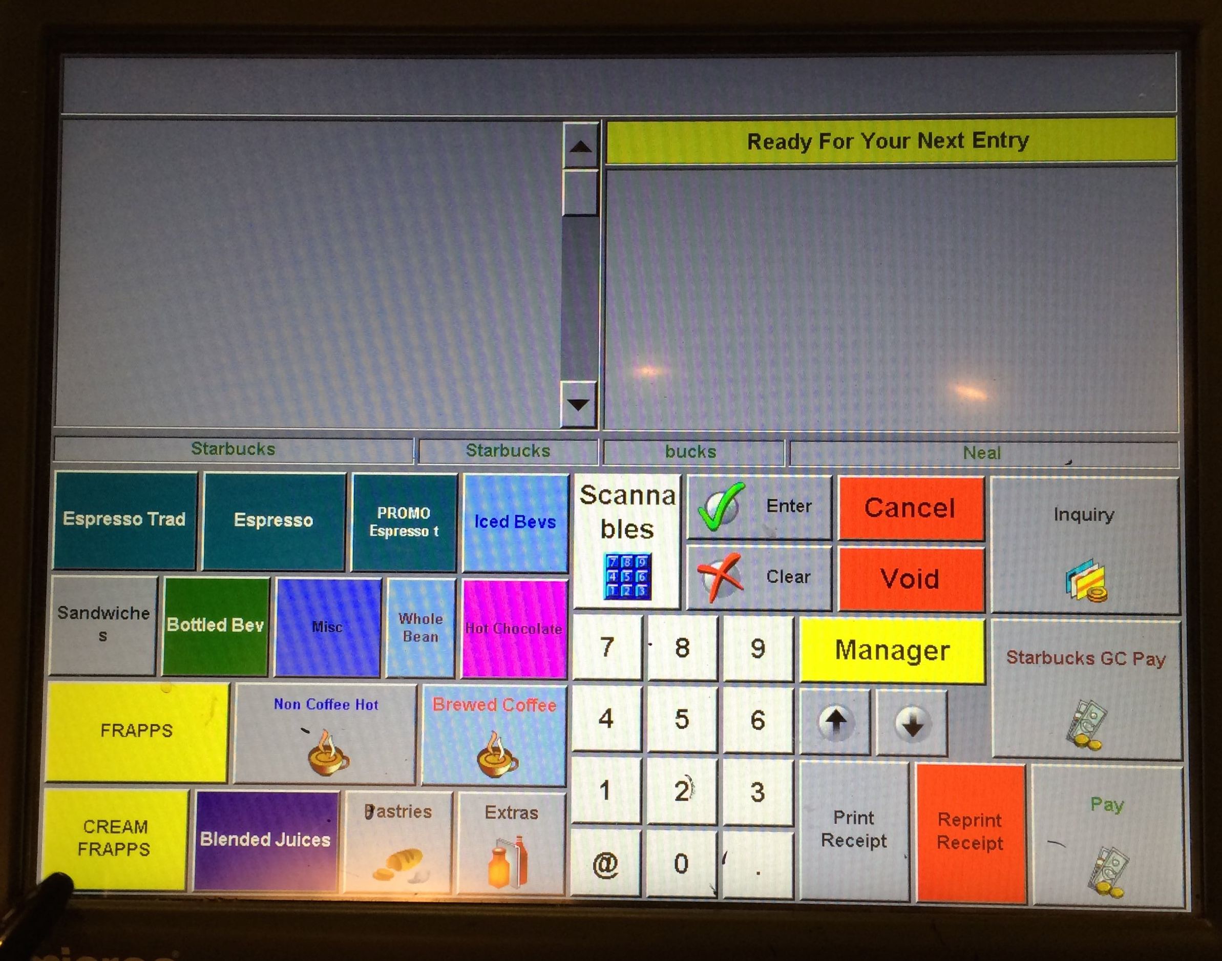 Starbucks Counter Initial Screen
Ugh.
Really?
Current Issues
Let’s dig a little deeper, and we can find more issues:
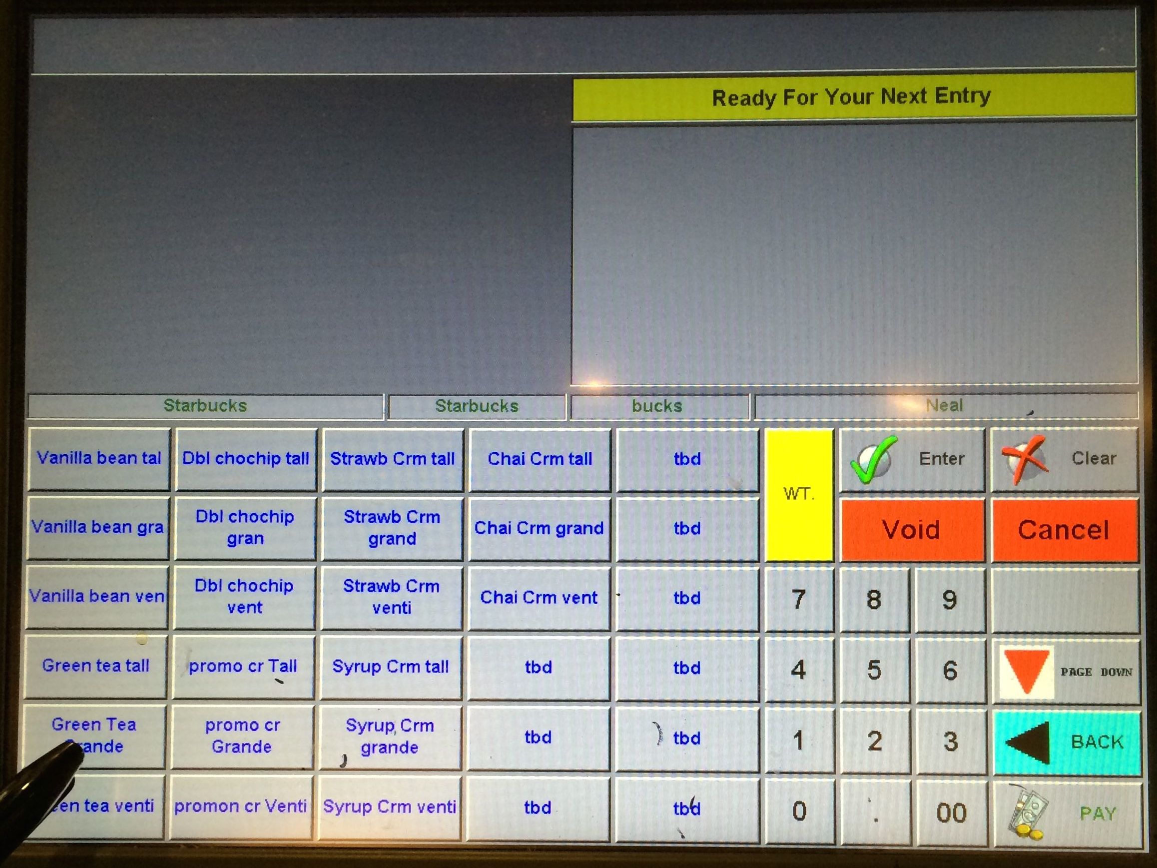 Item Chooser Screen
-
May I have a tbd, please?
-
What’s the “Starbucks Starbucks bucks Neal” all about?
-
Why can’t we select the size directly, but have to choose “drink + size”?
And let’s see a new Barista® getting confused. See how he hesitate when looking for the right button to press:
Redesign Opportunities
This would be a very interesting project to work on, as it’s very applicable to me (hey, I live in Starbucks), and it could be both visually and logically refreshing.
Sep 2, 2014
Horrible Interface 1
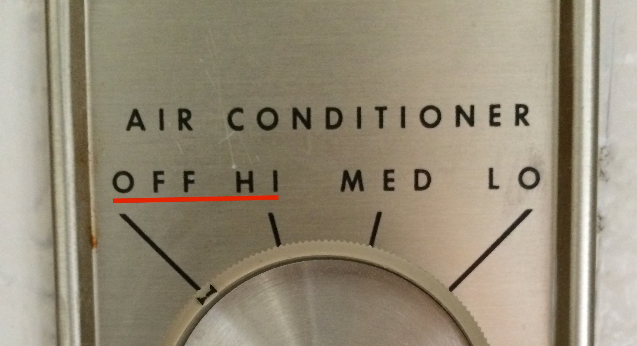
Not a lot of Notre Dame students have the honor to live in a dorm with air conditioning, but when there is an air conditioning in the dorm, chances are you’ll need some time to figure out how to actually use it.
Look at these magical control panels—
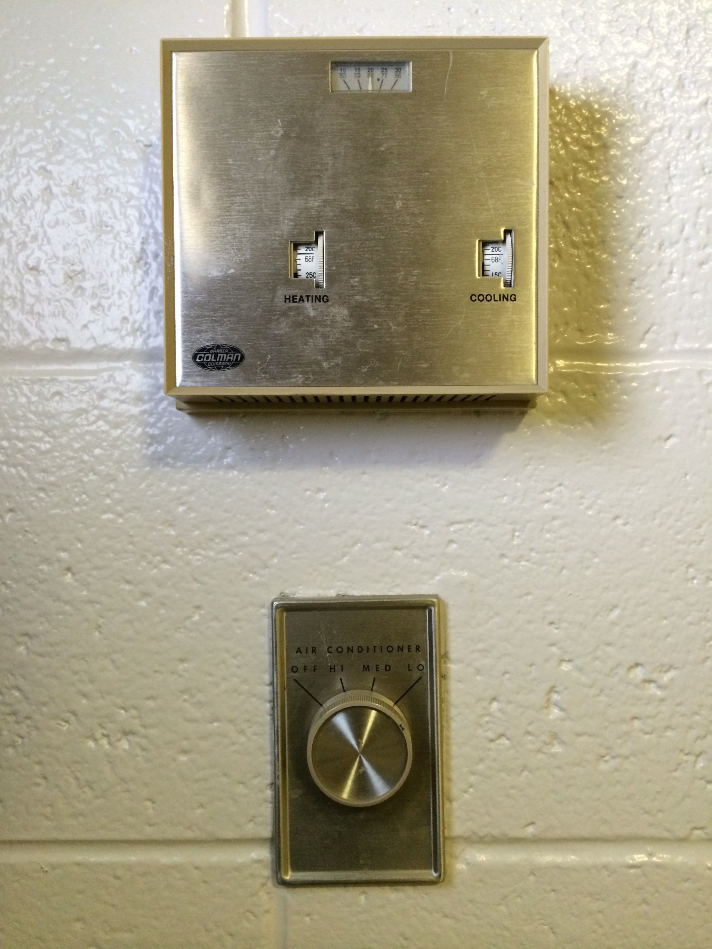 A/C Thermostat Controls
There you have it. Yes, it is very simplistic (which is usually good), and looks somewhat Art Deco, but the designers somehow managed to create confusion even with such a simple interface.
Current Issues
- There’s no direct feedback mechanism:
- The wheels are all mechanical, so when we roll it, we have no idea if the controls actually work; (just give us a light!)
- From my initial research, many people try to turn the temperature 3–5 degrees higher or lower than what they want, just to make sure the A/C is on.
- The labeling is confusing:
- What does it mean when I set “cooling” to 72F? Does it mean that I want the A/C to work when it’s warmer than 72F?
- Does “cooling” actually work, since there’s a wall unit A/C in my dorm?
- What would happen if I set “heating” to 75F?
- Will the A/C and the radiator both work at the same time?
- And… what is the knob below? Do they control the same thing?
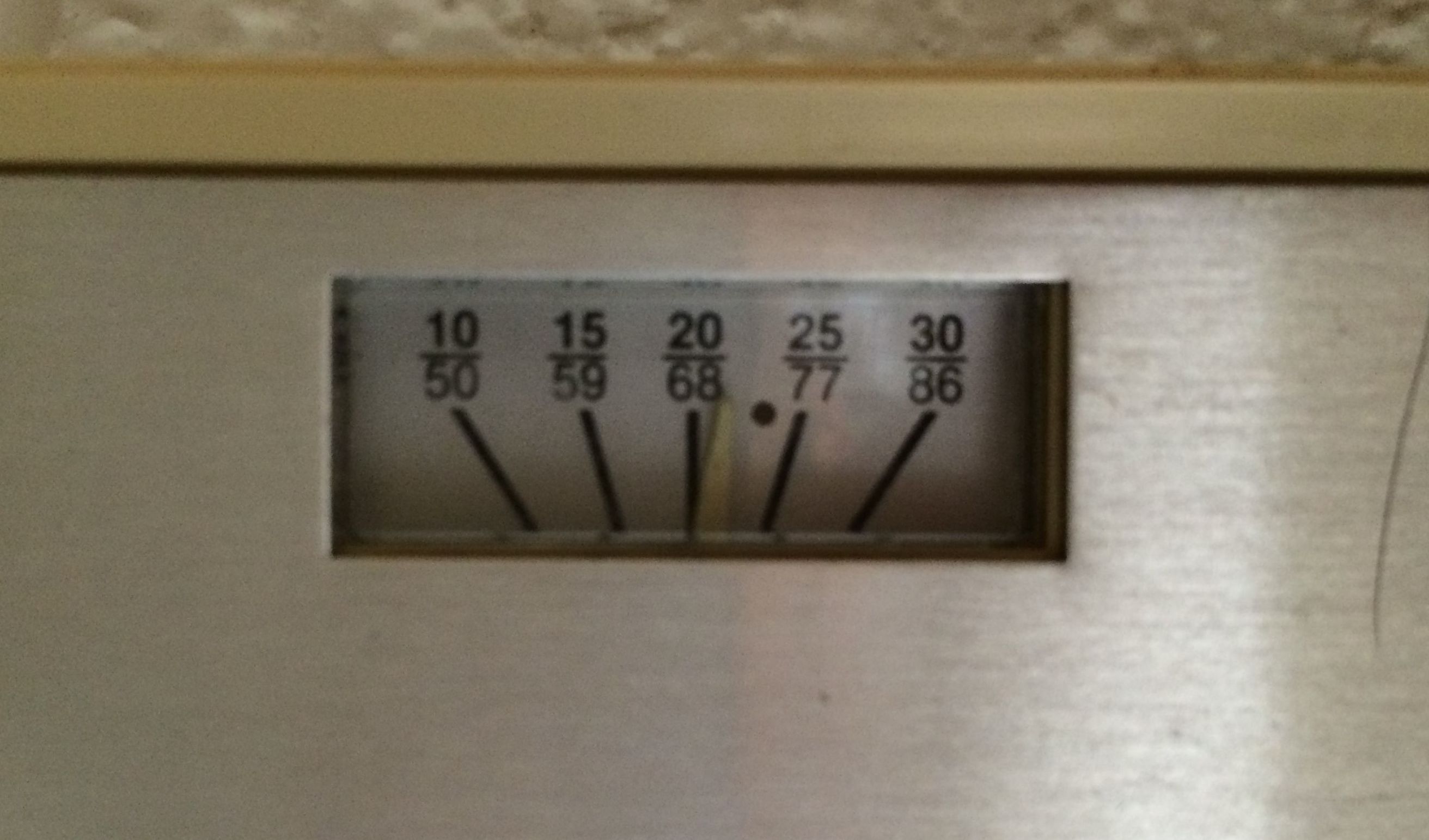 A/C Thermostat Close-up
 They’re not even aligned!
Redesign Opportunities
Apparently this system can be drastically improved, but the things we need to change are fairly simple, so I may not pursue this project. It’s great exercise for me to identify the issues, though.
Sep 1, 2014
First post
I’m super excited to take the VCD7: Interaction Design class! Last Wednesday (August 27) was our first class, and we did a quick experiment on how to mirror an iPad to the screens in the computer lab in West Lake Hall.
The controls are AWFUL!
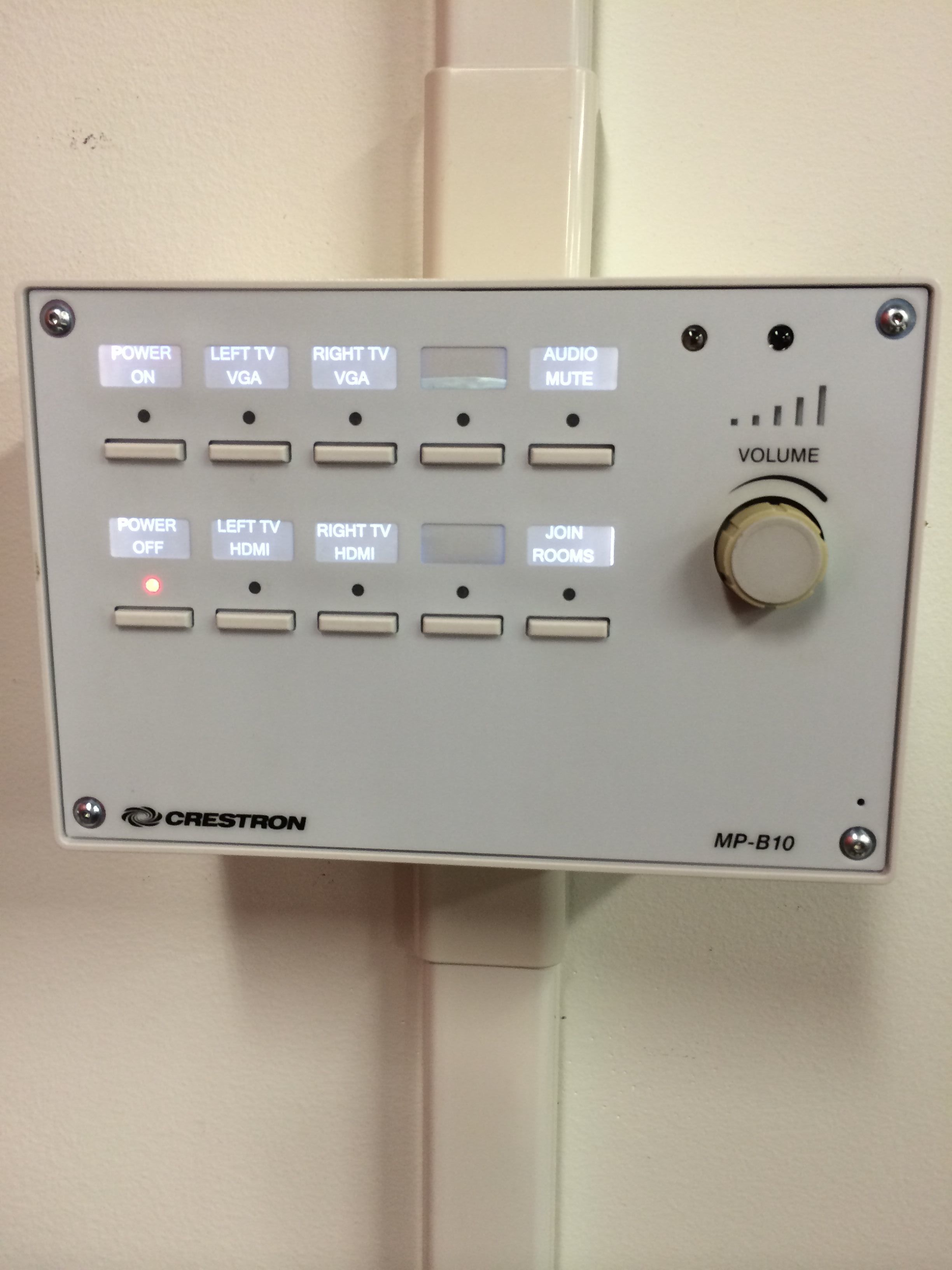 Mirroring Controls
Well, they’re not the worst I’ve seen, but in general these projection controls are difficult to work with. There’re usually a million buttons all over the place, and no one ever uses all of them.
For this specific box, there are some tricks, as usual:
- You need to know if you’re using VGA or HDMI, and I assume not many people even know they are different;
- You have to press “Join Rooms” before choosing the source, or things will break;
- The volume knob is very gentle, and you have to roll it very far to make the volume up.
So for this exercise, we made a quick movie with AfterEffects to show how the process works:
Mirroring Process Video
This is such a painful process, but hopefully after this course I can fix it, as well as other bad user interfaces!